Sunday, 24 May 2009
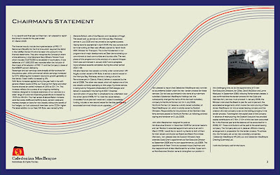
Caledonian MacBrayne Annual Report
We were asked to design an Annual Report for several different companys. I choose to to re-design the annual report for Caledonain MacBrayne. The corporate message of this annual report was to show that the company is proffesional, the reason I choose the colours for my spread was to give it a softer feel and also the lines througout the spread were to create a wave which I feel was appropriate for this subject.


Mapping
Subscribe to:
Comments (Atom)


